

暮らしを豊かにする
木のマンションリノベーション
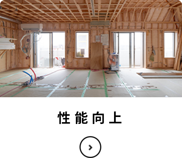
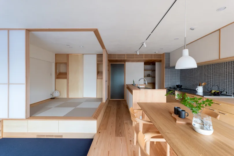
住環境として高いポテンシャルを持つマンション。
温熱環境、間取り、収納計画など、最善の設計施工を施すことで
終の住処として快適で豊かな暮らしの場とすることができます。
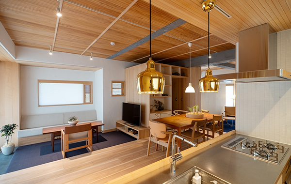
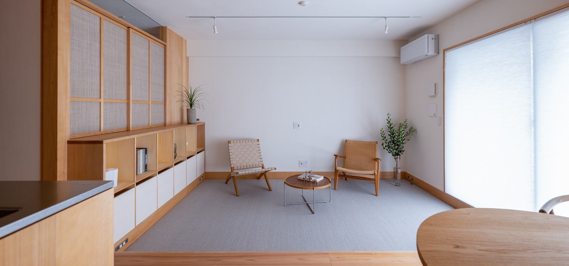
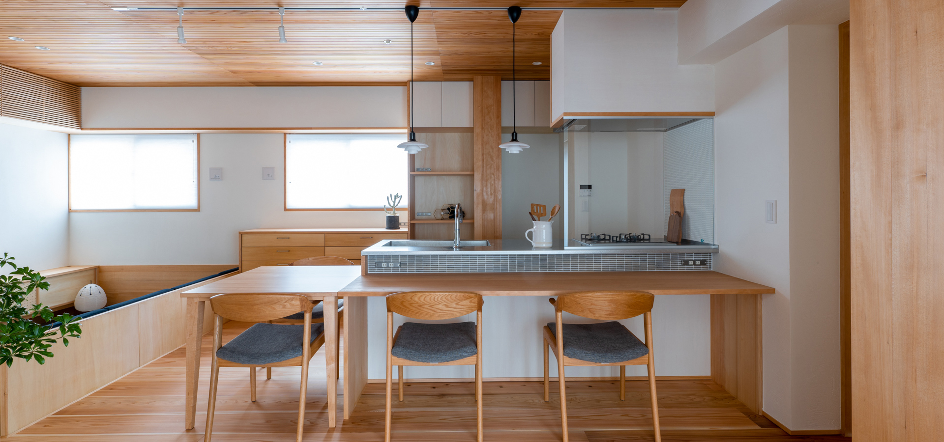
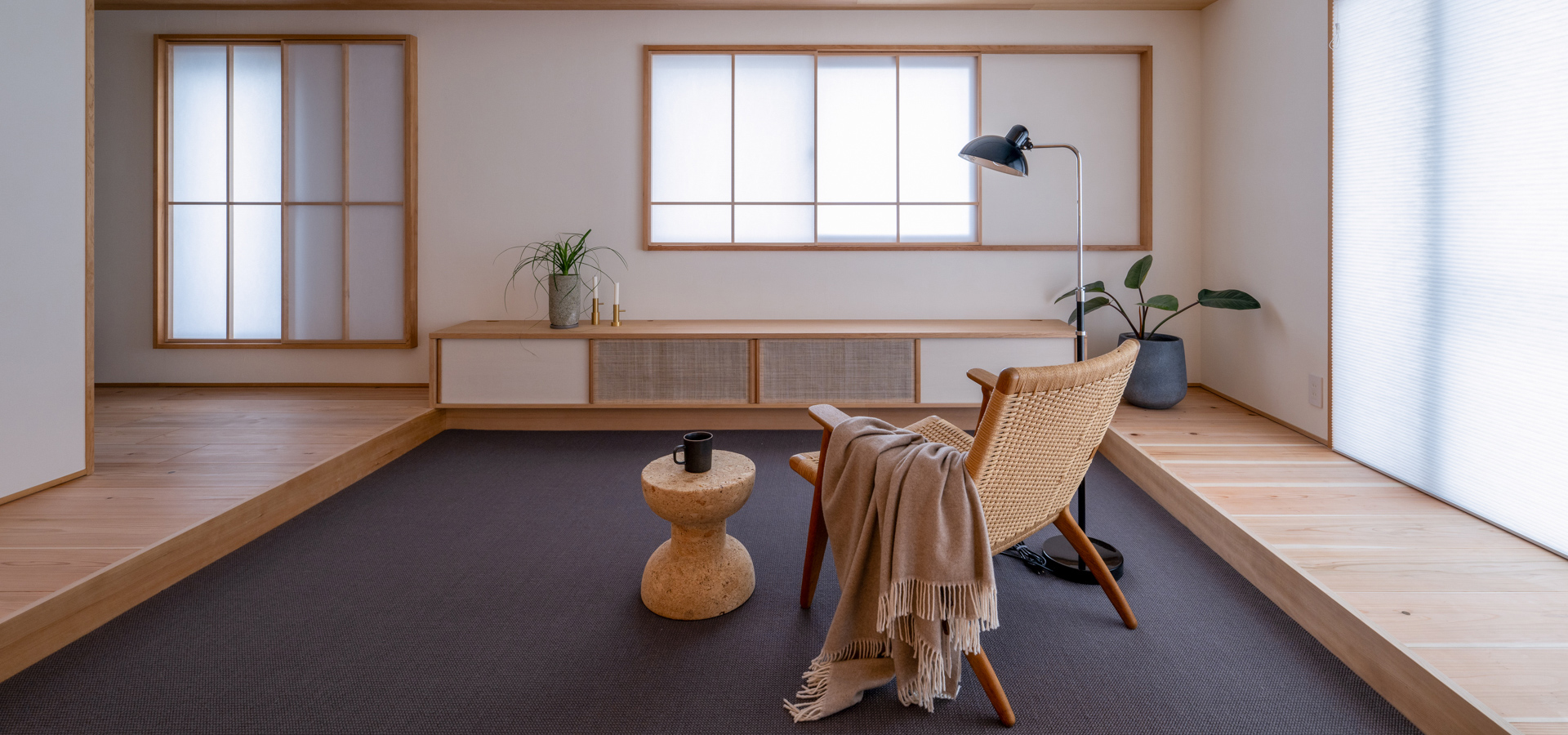
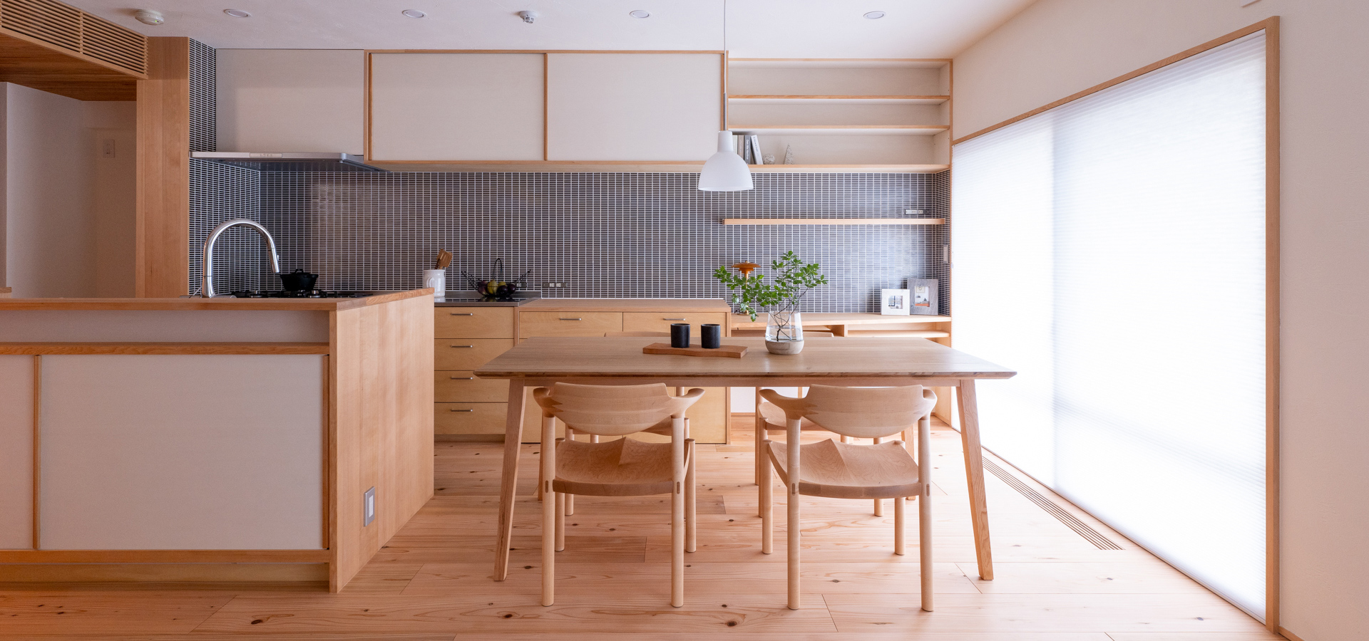
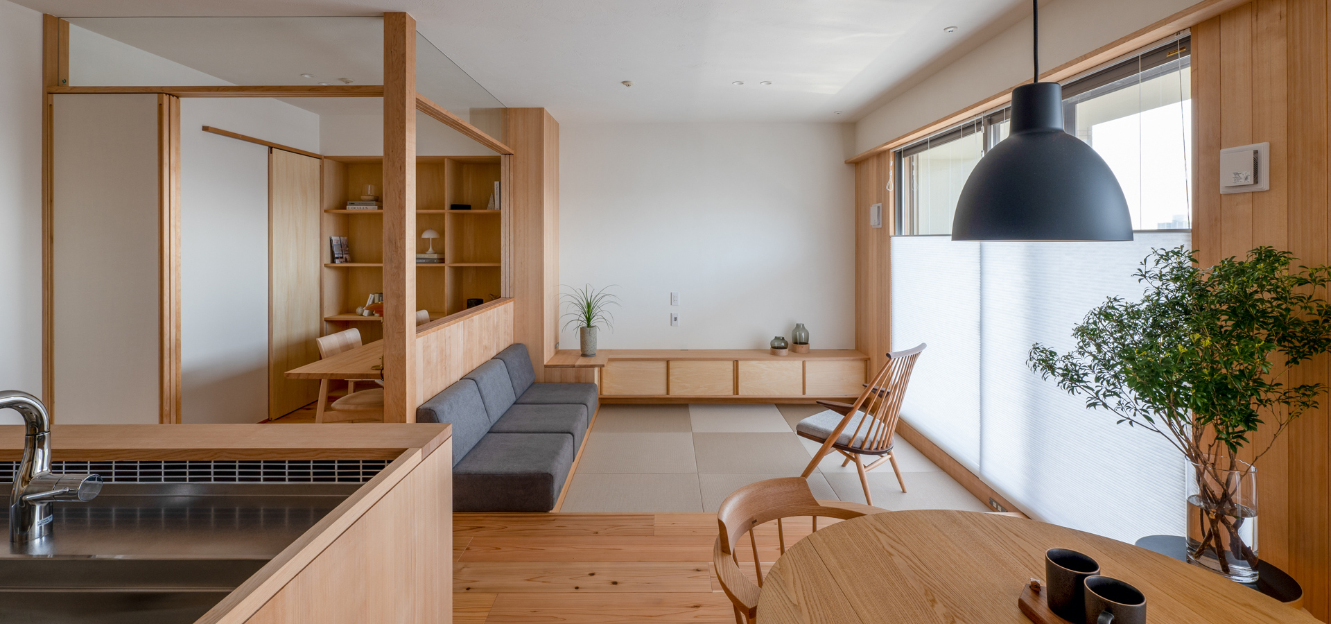
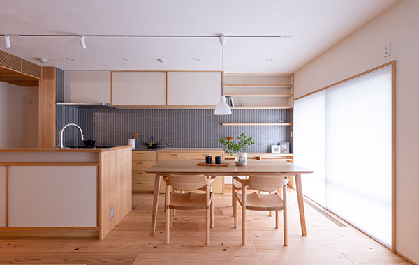
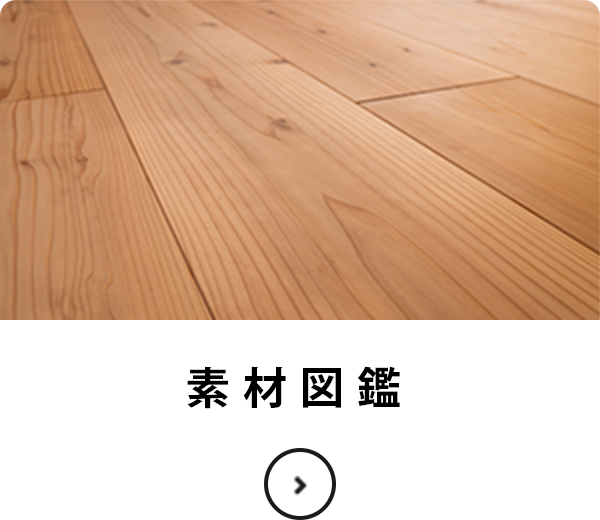
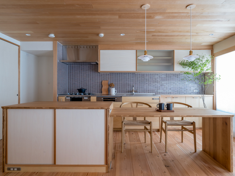
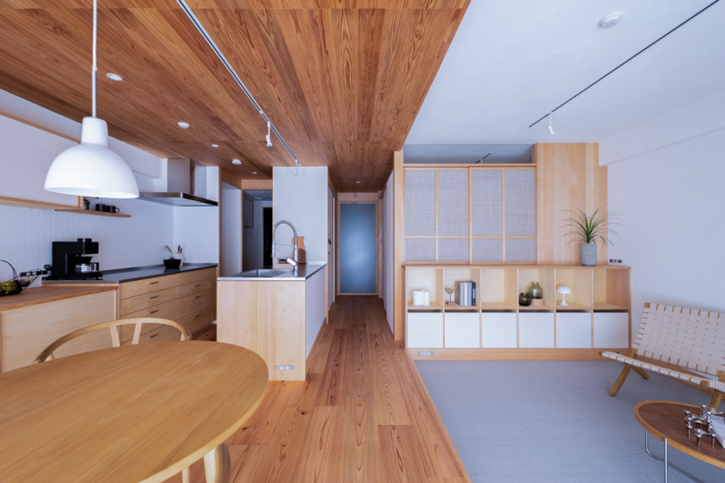
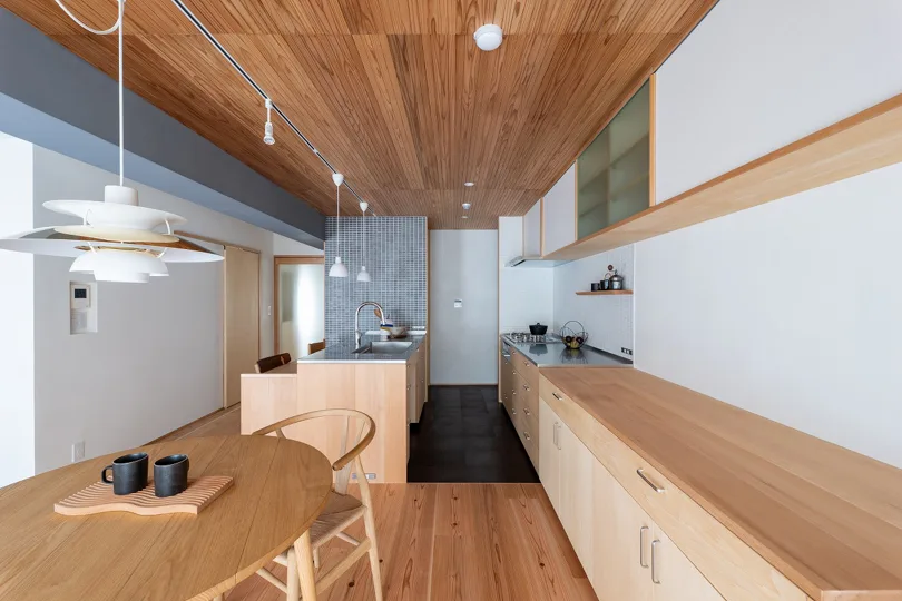
無垢の木や自然素材に包まれたデザインのある暮らしを提案する。
それが、マンションリノベーション専門の設計工務店Toivoです。
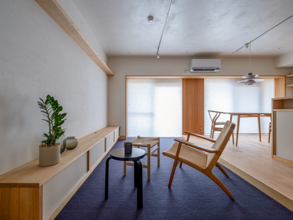
十人十色の暮らし方を造り込む
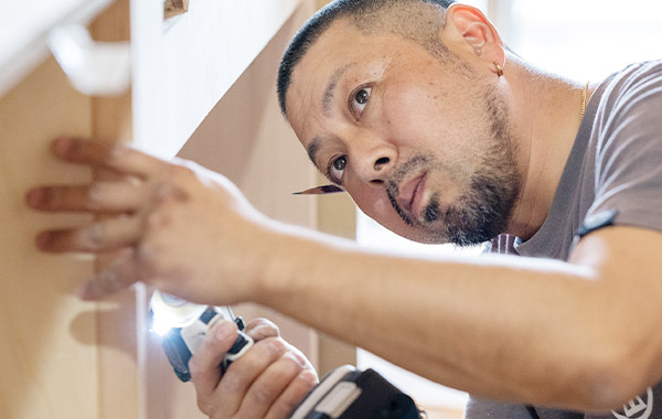
大工の手仕事
設計チームが作ったプランを
大工がその意図を汲んで
手仕事で作り上げていく。
月日が流れるほどに真心や粋な計らいを
感じていただける住まい。
十人十色の暮らし方をオーダーメイドで造り込む
木のマンションリノベーションは、
大工棟梁の腕で決まります。
Toivoの住まいづくり
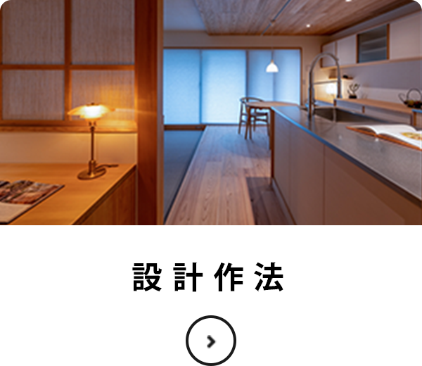
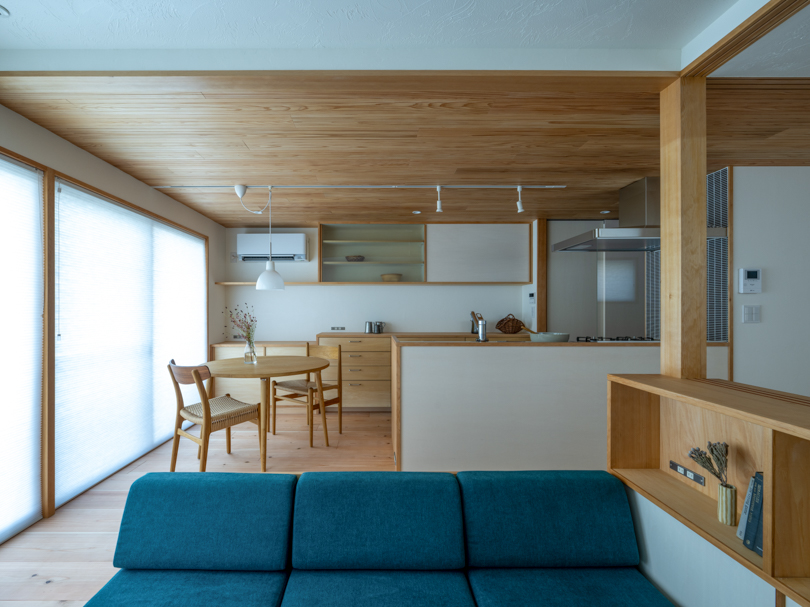
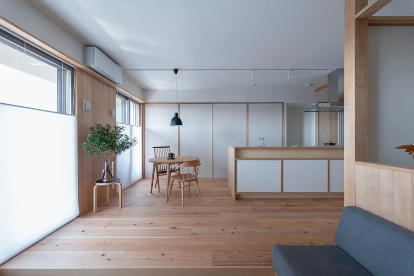
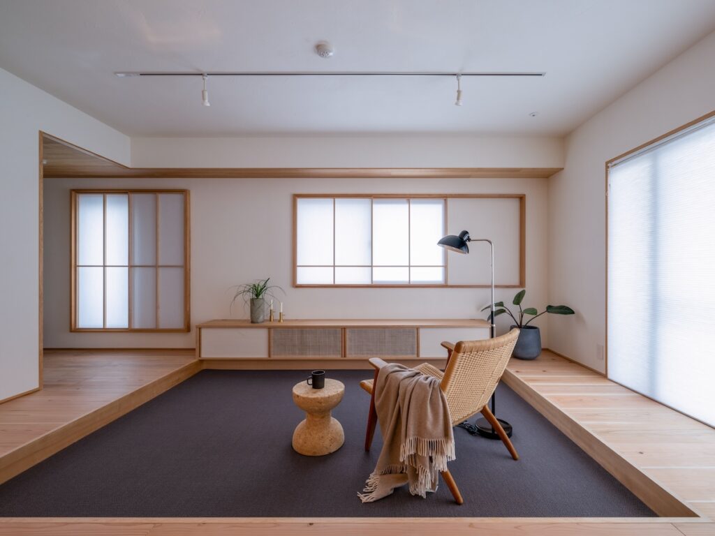
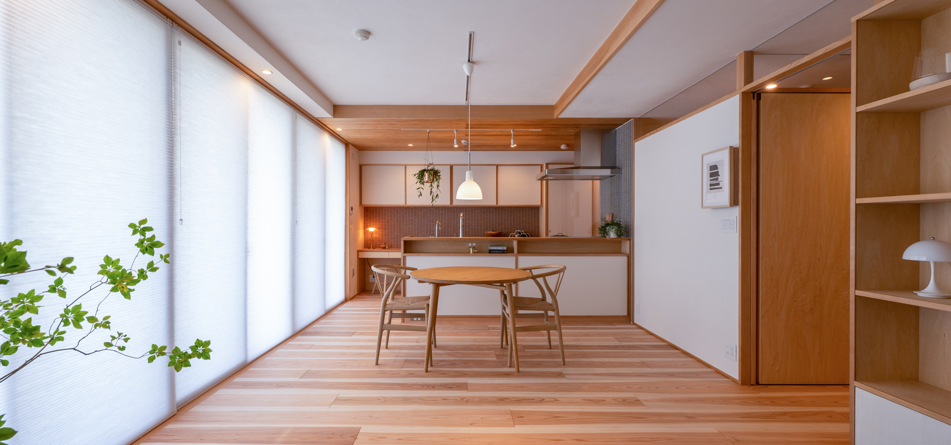
OLOとはフィンランド語で「居心地」の意味。
普段から行っている断熱改修や素材で仕上げたモデルルームです。
「木のマンションリノベーション」のデザインと
居心地の良さを体感しにいらしてください。